



Msingi.
Owning a share of a building should feel as solid as the building itself.
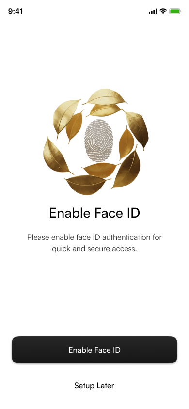
Owning a share of a building should feel as solid as the building itself.
Msingi (Swahili for foundation) lets people in Kenya put small amounts into income-generating, regulated real estate. Money goes into Imara, the core income fund. As your Imara holding grows, tiers of Prime, a premium property opportunity, unlock. Dividends land in the wallet or get reinvested automatically.
The flows already worked. The product looked like any other fintech app. My job was the UI theme revamp: set a new visual standard so the app reads as investment and construction at a glance, and make it feel more premium.
Kenya's listed REIT market cap, nearly tripled in five years. Interest is real, but the market is still small.
Capital FM · Mar 2026Urban home ownership in Kenya, among the lowest in Africa. Owning property outright is out of reach for most.
The Standard · Apr 2025Homes needed each year against roughly 50,000 delivered. Property is short, so it stays valuable.
UN-Habitat / Habitat for HumanityBlue buttons, flat cards and stock icons. You could swap the logo for a bank's or a wallet's and nothing would change. People were buying a share in buildings and never saw one.
Prime unlocks from your Imara balance, but the rule lived in a paragraph. Nobody could see where they stood or what came next, so the upgrade never felt like a reward.
New investors need to see “regulated, secure, real” before they part with money. The old UI looked cheap where it needed to look calm and expensive.
A schematic of the old look (actual old screens aren't shared). The structure was fine, and the team had already tested the flows. That made this a skin-deep change with deep impact: a new theme on top of proven flows, not a redesign of them.
A quick round before visuals: a competitor audit of local and global property-investing and fintech apps, a review of the existing flows with the product owner, and conversations with the team about what investors were asking support.
People trust bricks they can picture. Charts alone feel like gambling, but buildings feel like owning something. The UI should keep showing the asset.
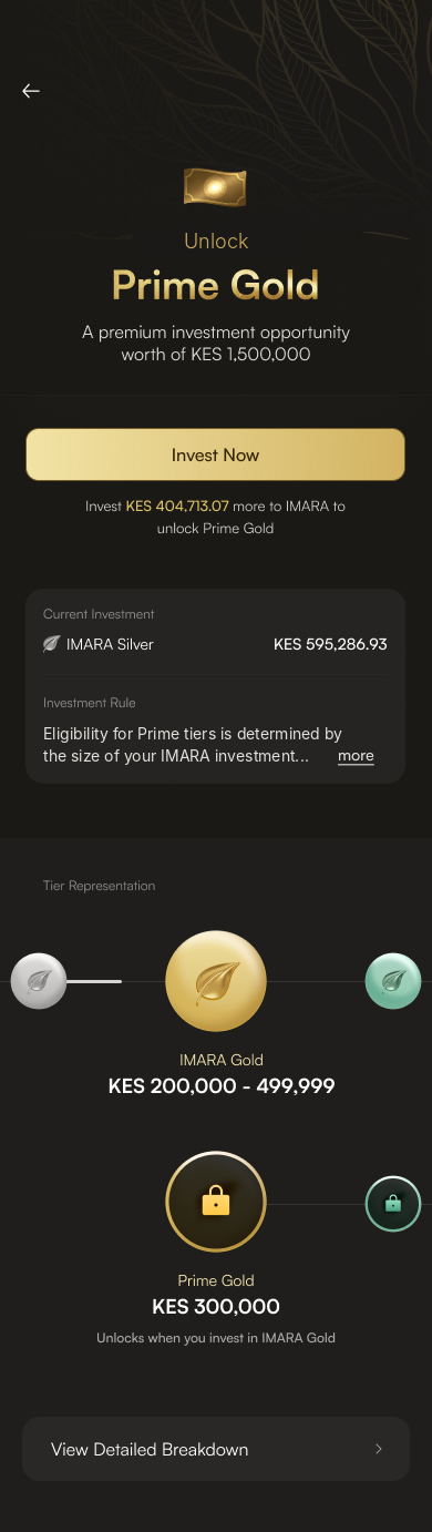
A visible next tier (“KES 404,713 more to unlock Prime Gold”) motivates more than a list of rules. The goal has to be a picture.
Rich apps use few colours, lots of white and one precious material. Gold works only if it's rare.
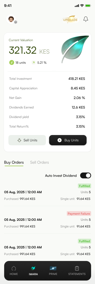
Seeing a payout land is the moment people come back for. It deserves its own colour and a reinvest switch close at hand.
Insights are summarised from the audit and team sessions, not a formal study with a recorded sample.
Insufficient investment for tier eligibility.
KYC pending. Await approval.
Dividend credited to account.
Four words to judge every screen against. Each one turned into a material.
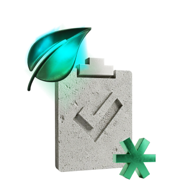 SolidConcrete. The building, the foundation.ValuableGold leaf. Money that grows.AliveEmerald glass. Returns, motion, life.
 CalmOff-white space. Room to breathe.
A leaf grows season after season. A gold leaf marks anything about invested money: tiers, Imara, unlock rewards.
Concrete is what every building starts from. Concrete-textured icons mark anything about buildings, accounts and paperwork.
Concrete × gold, one object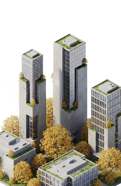 Isometric city models
Moodboard tiles are recreated as textures. The referenced photography isn't reproduced.
Grey boxes, decided before colour: one hero illustration slot per screen, one dark primary action, numbers big and light. The rule: an illustration explains the screen; the UI stays quiet.
Same wireframes, three answers to “what does this money feel like?” We judged them against the four words.
Safe and familiar, and that was the problem. Still nothing said property. Rejected.
Strong, but heavy. Hazard yellow and grey read as a building site, not a place to keep savings.
Calm off-white UI with dark actions, and the materials kept for illustrations, tiers and rewards. Chosen.
Information architecture · flows · grid & spacing · copy · component behaviour
Colour · materials · illustration style · surface depth · dark or light canvas
#8A6420 → #F3DD9C → #C9A04A#141412#1C1B18texture · #D8D7D1 base#F9FAF7#E5EBE1#8CC63F#1FBF94#2E6A86#F0503AFigure · 48 LightTitle · 28 MediumItem · 17 MediumLabel · 14 RegularOverline · 12 CapsMoney is always the biggest and lightest thing on screen: wide and calm, never shouty. The currency sits in grey so the number leads.
Built live below as real HTML, not images. Each one carries just enough material to belong to the theme.
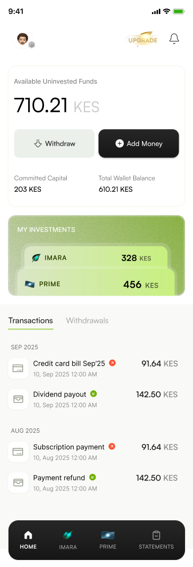
 IMARA328 KESPRIME456 KESIMARAPRIME
Every key moment gets one object: onboarding, verification, risk, rewards, invites, goodbyes. Gold leaves circle anything about investing. Concrete is used for the buildings, the documents and the account itself. A touch of emerald means growth.
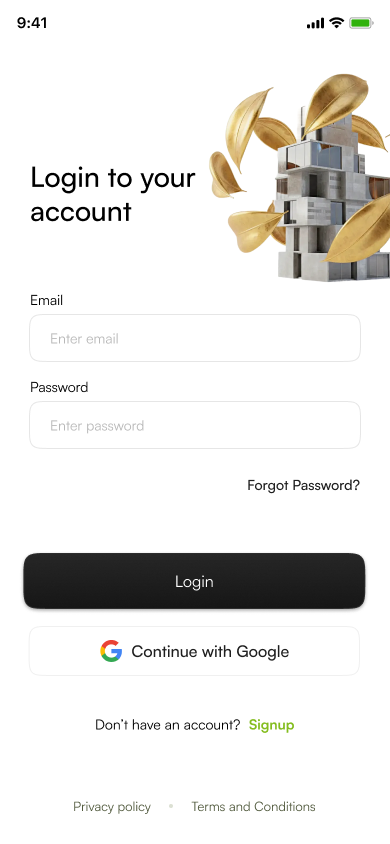
Splash cityThe asset, front and centreConcrete × goldSign up & log inSecure deviceBiometrics, OTPCommunityMembership, profileRisk checkFinal onboarding stepPrime certificatePremium tier GoodbyeClose accountInvite a friendLeaf on concrete: growth through people
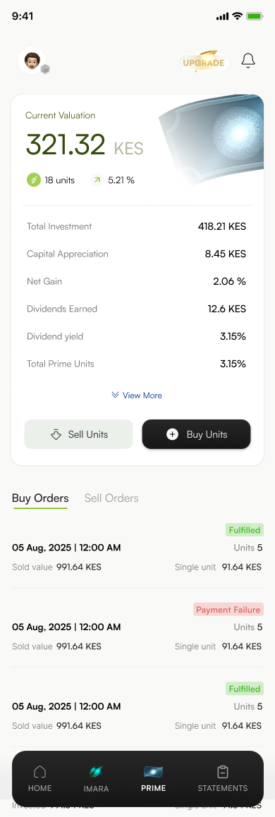
The rule is simple: the bigger your Imara holding, the higher the Prime tier you can buy into. I turned it into a ladder of coins: silver, gold, then emerald, each locked until you reach it, with one sentence that tells you exactly how far away you are.
Thresholds as shown in the design file.
The Imara screen holds the moment people come back for: a payout. Each part has one job.
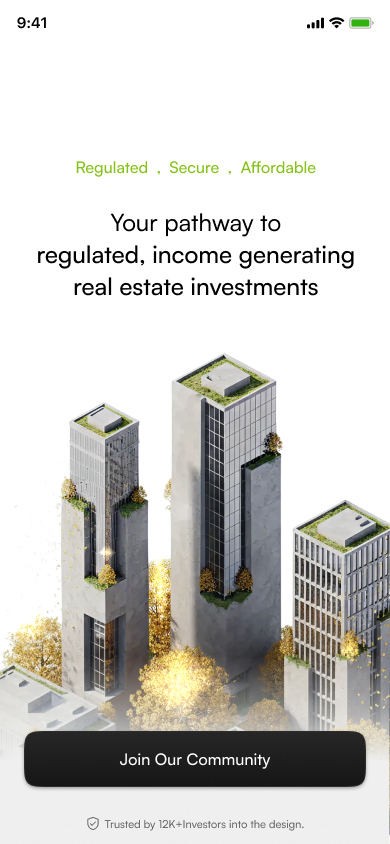
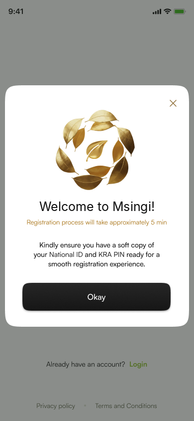
Regulated, secure, affordable. The city and gold leaves set the tone before a single form.
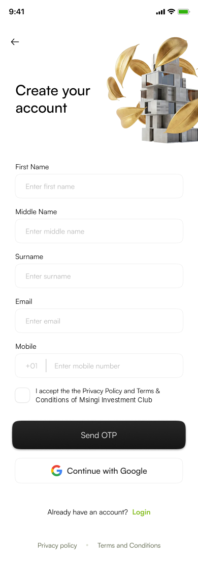
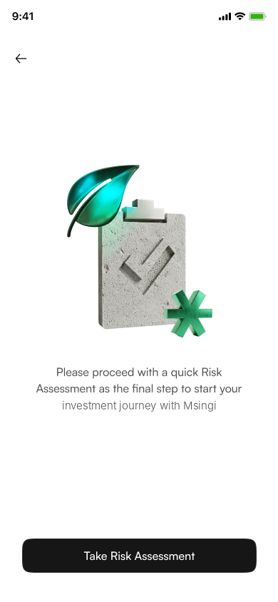
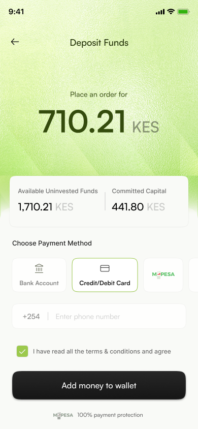
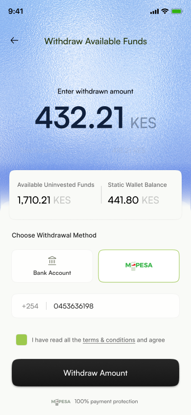
Frosted, gradient tops: lime for deposits, blue for withdrawals. You can tell the direction at a glance.
Emerald glass for Imara, the guilloché certificate for Prime, and dark and gold for the unlock.
Even the goodbye gets an object: a concrete frown and falling leaves.
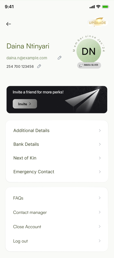

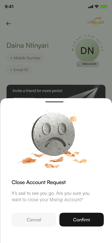
Screens re-themed on one token set: onboarding, wallet, Imara, Prime, account.
3D illustrations in one lighting and material system.
Materials as a visual language: gold leaf, concrete, emerald glass.
Shared UI standard the team now designs new screens against.
Onboarding completion, splash to risk assessment.
Taps on the Prime unlock prompt vs the old text rule.
Imara holders with auto-invest dividend switched on.
Support questions about tiers and eligibility.
“Target” cards are success metrics set for the revamp, not measured results.
The first drafts had gold everywhere and looked cheap. Pulling it back to tiers and rewards is what made it feel expensive.
Once gold meant money and concrete meant buildings, new screens were quick to design. The material told you what to use.
Motion for the unlock moment, a dark theme from the Prime palette, and a lighter illustration export for low-end Android.