A spa platform built for the company that sells it, the spa that runs on it and the guest who books through it, designed around ritual, stillness and flow.

Driftwell is a multi-tenant spa management platform. A software company sells it to spas; each spa runs its bookings, staff, customers, gift cards and campaigns from one back office; and each spa gets a ready-made booking website it can brand as its own.
Most tools in this space look like accounting software. Our bet: a spa is selling calm, so the tool that runs it, and the page guests book through, should feel calm too. I led the product design across all three surfaces, from flows to the visual language and illustration.
of salon and spa guests want to book from their phone.
Zenoti consumer survey 2025of salon appointments get cancelled or are no-shows. Every one is an empty chair.
Zenoti benchmark dataof online bookings happen outside business hours, when nobody is at the desk to answer.
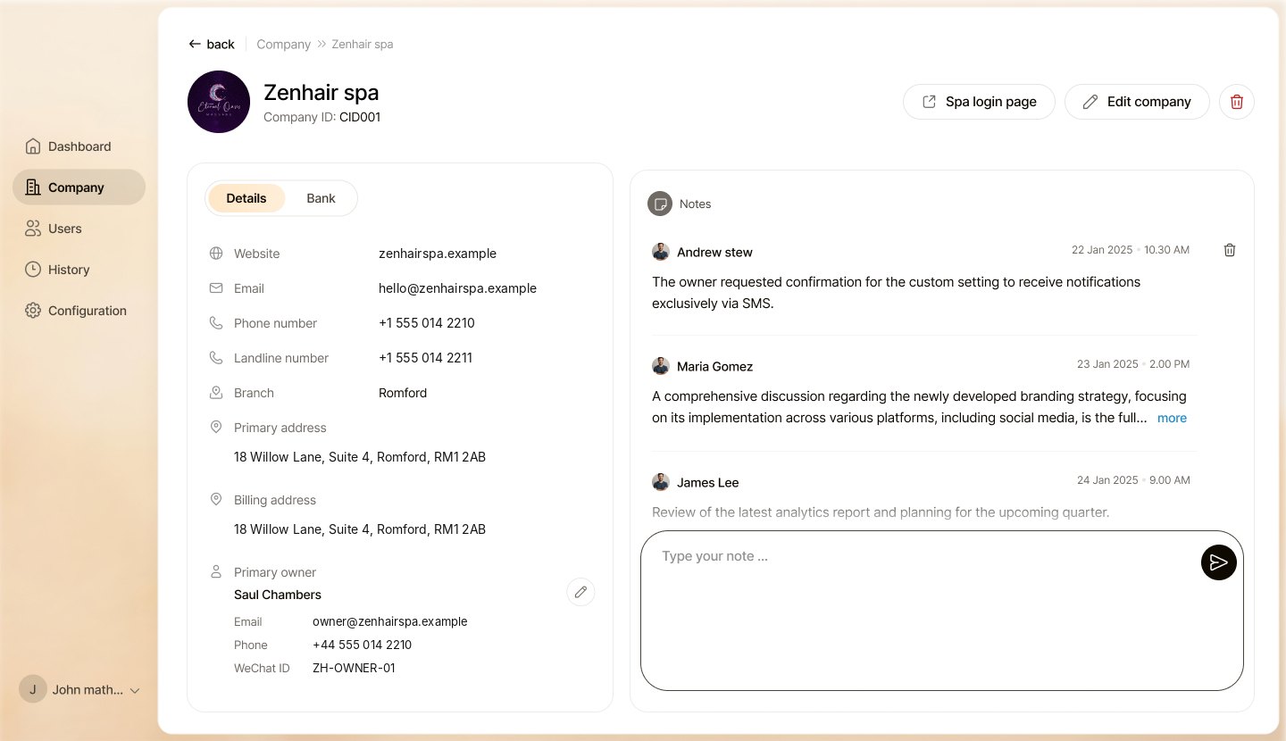
SimplyBook.me platform data 2025Onboards spas as companies, sets them up and watches the business of the platform.
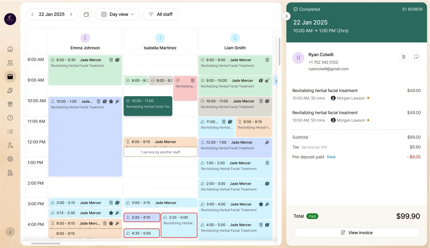
Everything that happens between the first booking and the end-of-day register.
Lands on the spa's own branded site, picks a ritual and a time, and pays a deposit.
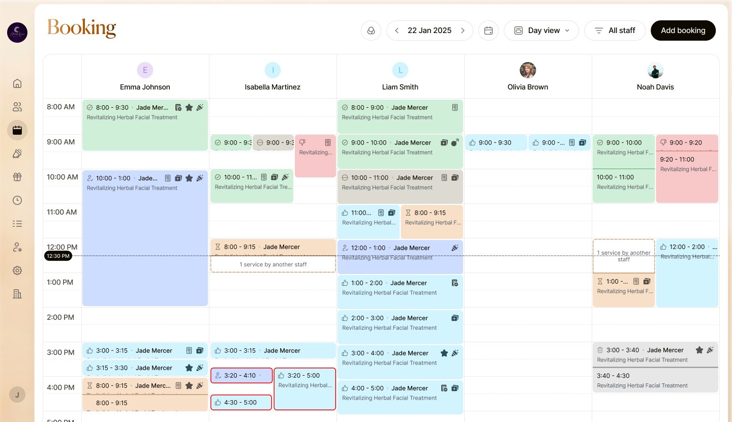
Seven booking states, overlapping services and staff on leave, all in the same blue boxes. Front desks double-booked therapists and missed no-shows.
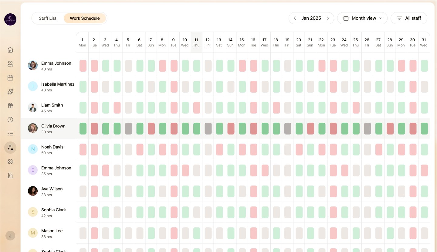
A booking widget, a POS and a spreadsheet for staff hours. Nothing knew about the others, so deposits, cancellations and rosters never matched.
Guests went from a beautiful spa website to a generic form with someone else's logo. Spas wanted the page to be theirs.
The desk scans the day for one thing: who is in, who is late, who never came. Colour has to carry status before anyone reads a word.
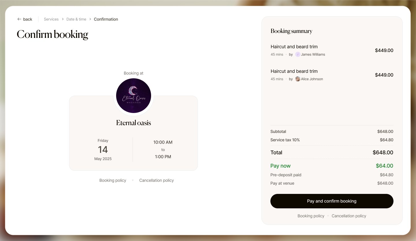
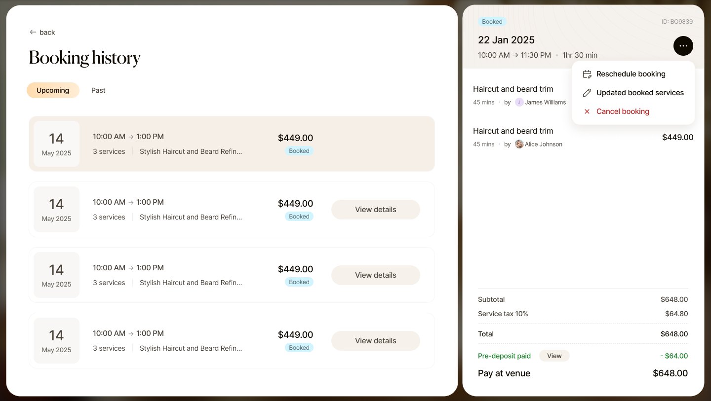
Owners trusted a small pre-deposit more than any reminder. The booking flow had to make paying a part, then the rest at the venue, feel normal.
A booking is only valid if the therapist is working and skilled in that service. Schedules and specialisations had to feed the calendar.
Owners cared about their logo, photos and colours on the guest site more than any feature. White-label was the selling point.
Research summarised from team sessions and stakeholder conversations; personas below are composites.
I need to see which spas are growing and which are about to leave.
At 10 a.m. I want to know the day is under control without opening five tabs.
Let me pick a time and a therapist, then leave me alone until the day.
Before any screen we agreed three words. Each one became a rule the whole team could design against.
Warm sand instead of white, generous space, one dark action per screen.
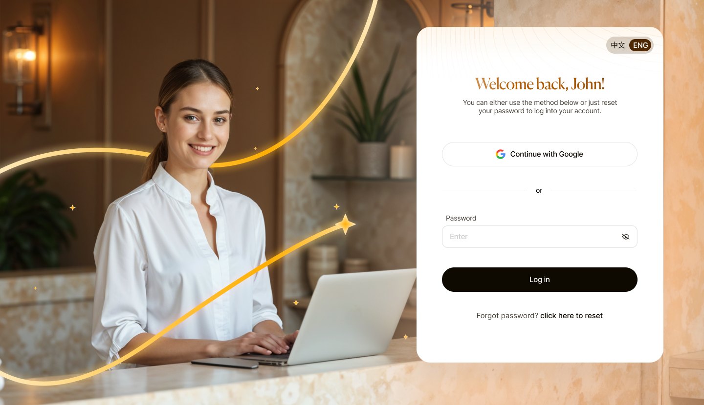
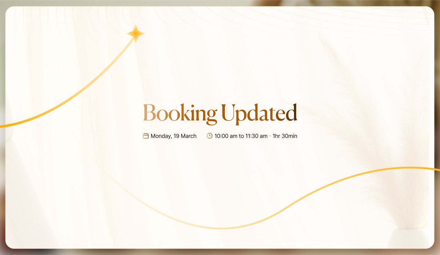
Deep plum and a four-point star, for the moments that matter: confirmed, updated, welcome back.
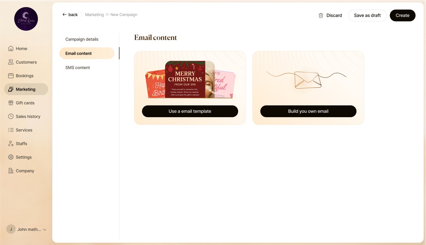
A single golden line that travels through the product and lands on a star when something is done.
Line-art objectsMoodboard tiles are recreated as textures; reference photography isn't reproduced.
Grey boxes for the six screens everything hangs off. We tested these with two front desks before any colour, mostly to settle the calendar.
The platform needed a name the spa could sit next to without being overshadowed. The mark is the product's golden line, landing on a star, inside a plum night.
#FCF6EF → #F9CFA8#1E140B#4A2A0A#FFD873 → #FFB400#2B0F3A#FFE6C4#C8862A#C62B2BEach state has a pastel fill and a single-line icon, so the calendar still reads for colour-blind staff.
Display serif
Page titles, greetings and moments only: "Good morning, Jon!", "Booking", "Booking Updated". Set in honey-to-bark gradient for the big ones.
Display · 44 · gradientTitle · 30Figure · 36 MediumItem · 16 MediumMeta · 14 RegularTwo styles, one rule each. Line-art objects for empty and warning states; soft flat objects with paper texture for drawer headers. The golden flow line ties them to the brand.
Flow backgroundLogin, confirmation, updated
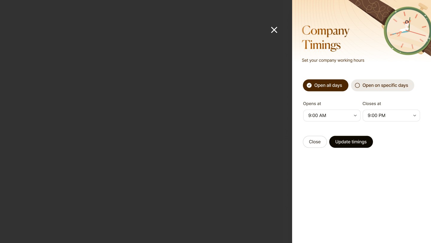
TimingsOpening hours drawer
SecurityChange password
LanguageEnglish · Chinese
Line artCampaigns, empty notes
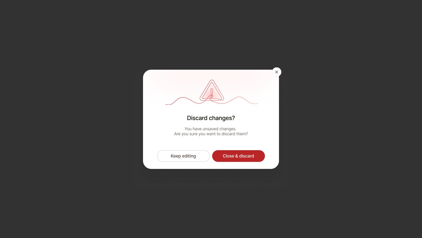
Warning, drawn in one strokeDiscard changesRebuilt live in HTML, not screenshots. 48 components in the library; a few that carry the theme:


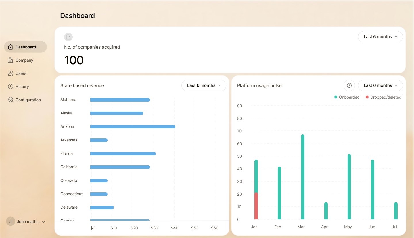
Plain and fast: companies, revenue by state and a platform pulse of spas joining and leaving. Notes keep every account conversation in one place.


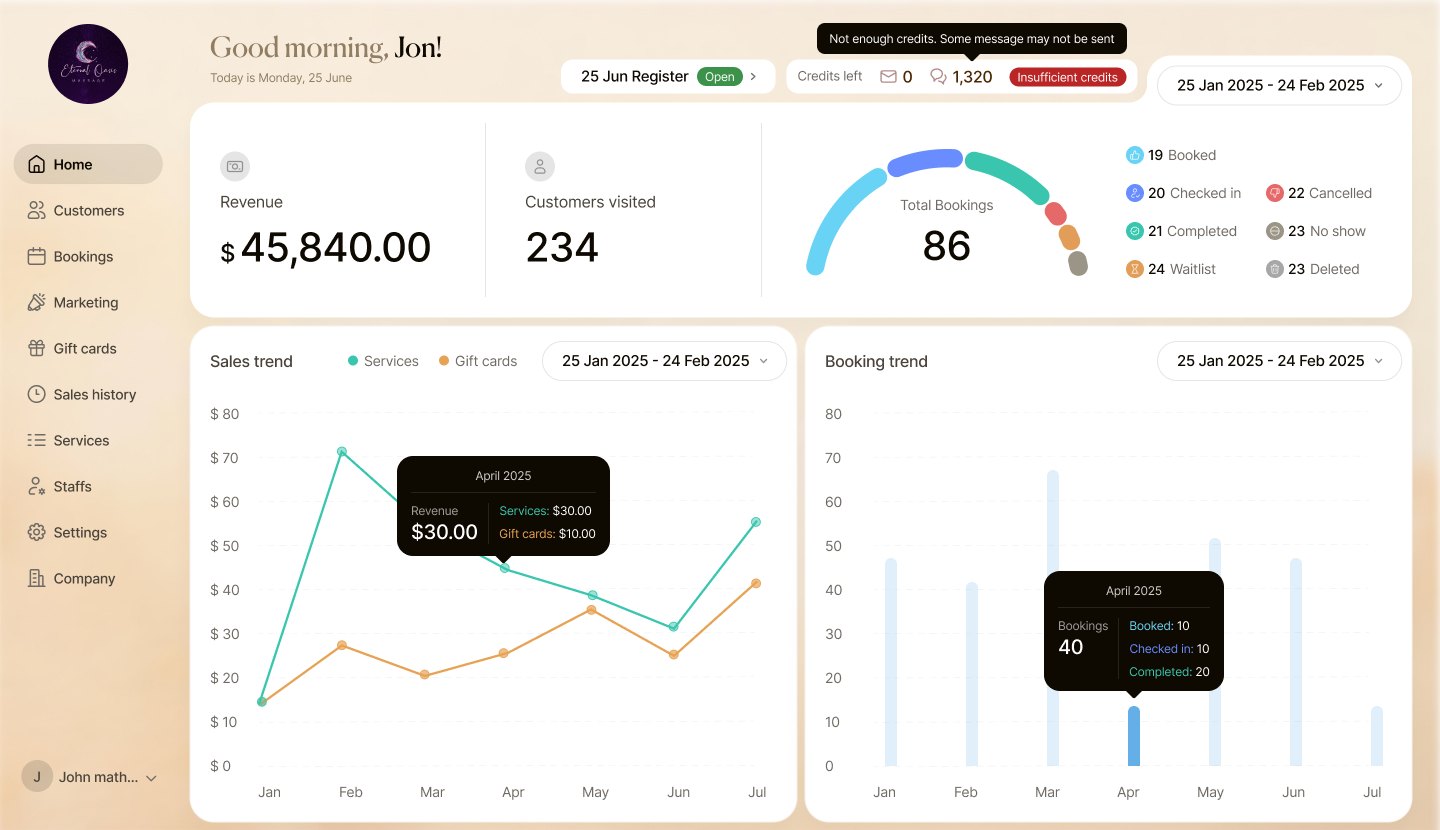
A greeting, the day's money and a booking ring first; then calendar, schedules and campaigns. SMS and email credits warn before they run out.


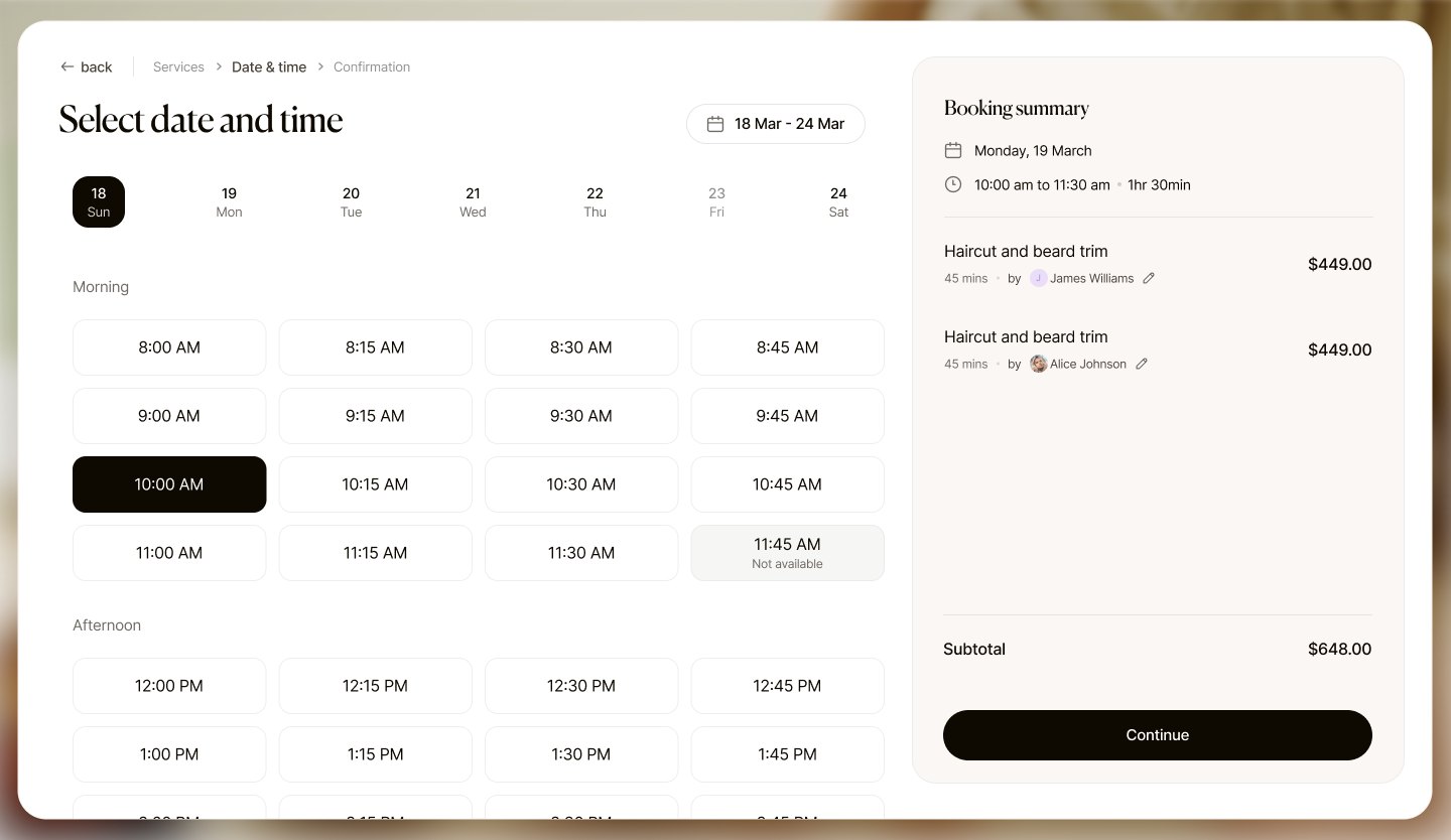
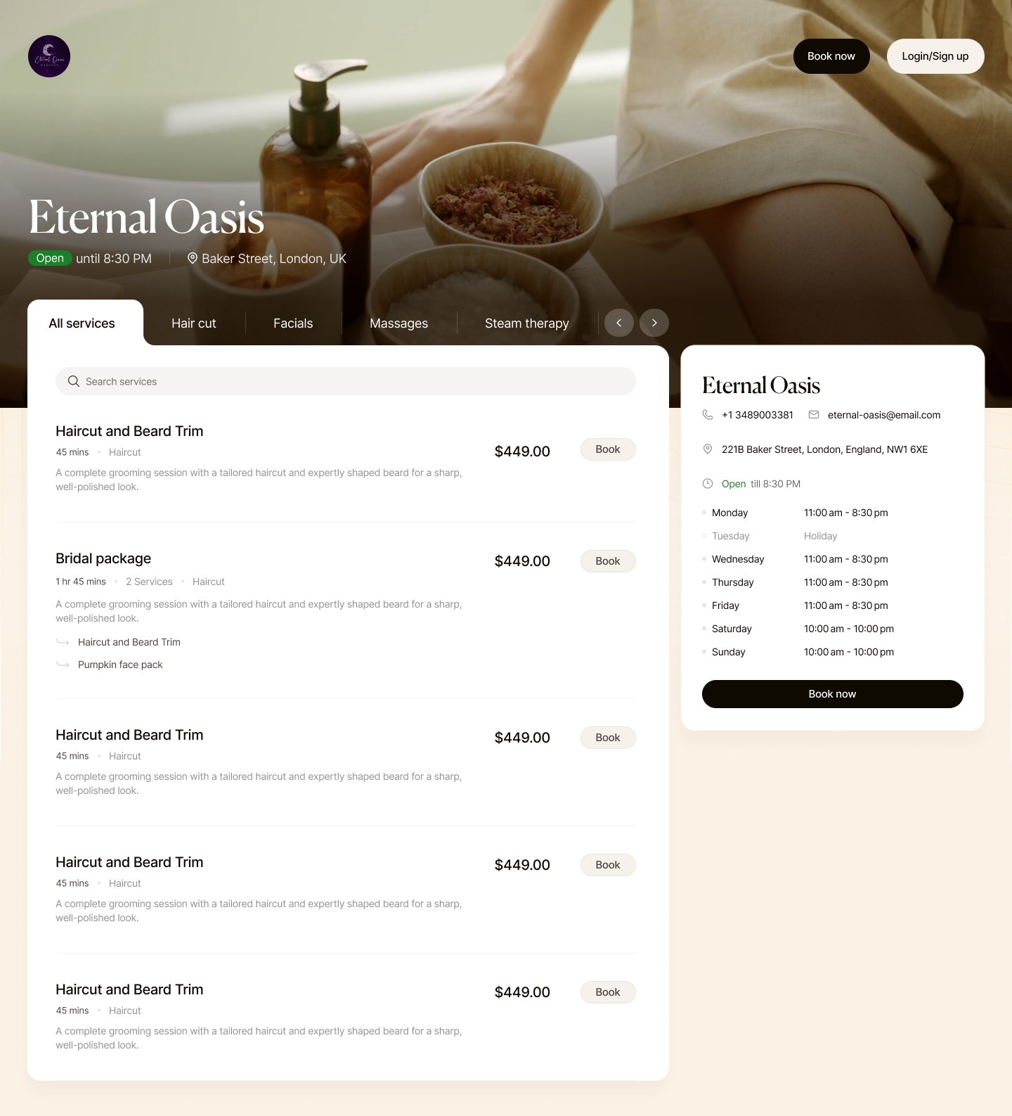
The spa's name, photo and hours lead; Driftwell stays in the footer. Three steps, a summary that follows you, and a deposit that's clear before you pay.


The guest site is a template. Each spa sets four things and gets a booking page that looks like theirs: logo, hero photo, one accent colour and its own domain. Driftwell's calm layout stays underneath.
Spa names are demo tenants from the design file.
Connected products: super admin, spa back office and guest web store.
Desktop screens across the three products, in two languages.
Booking states with one colour and icon system, shared everywhere.
Design system and illustration set, reused by every spa's store.
No-shows, through required deposits and clear cancellation fees.
Median time for a guest to complete a booking on the web store.
Of bookings coming through the white-label store instead of phone.
To onboard a new spa, from company created to first booking.
"Target" cards are the success metrics we set for launch, not measured results.
Once pastel meant status, we could never use it for decoration again. The rule saved the calendar.
Early drafts had gold everywhere. One gold thing per screen is what made it feel premium, and quiet.
A mobile app for therapists' own schedules, and a week view that groups by room instead of staff.